I will be presenting a free webinar on Tuesday, March 16 at 11 a.m. Pacific time. This presentation will consider 5 common Web usability problems and how to avoid them. You’ll learn ASP.NET techniques to improve input validation, avoid confirmation alerts, simplify complex forms, and more!
To register, visit http://my.dimdim.com/philweber/. Thanks!
I joined Corillian Corporation in July, 2004. I spent about a year in tech support then switched to training, where I’ve been ever since. Last June Corillian was acquired by CheckFree, an online bill-payment provider. In December, CheckFree was acquired by Fiserv. In the space of about six months (without changing jobs), I’ve gone from a company of about 250 employees to one with over 22,000 employees!
One advantage of working for a larger company is the opportunity to explore different roles within the company. I’ve been fascinated by user experience (UX) design since I read Alan Cooper’s Guest Opinion columns in BASICPro (now Visual Studio Magazine). Those columns were excerpts of Cooper’s first book, About Face, which I similarly devoured as soon as it became available. And I found his VBITS keynote presentations in the mid-1990s thought-provoking and inspiring.
As an independent software developer, I wanted to create applications that were not just functional, but were a pleasure to use. My clients were usually more interested in having their apps delivered as quickly and inexpensively as possible. This conflict was a repeated source of stress to both me and my clients, and contributed to my decision to leave software development for the less schedule-driven disciplines of tech support and training.
When CheckFree acquired Corillian last year, I was excited to learn that CheckFree has an entire team (“User-Centered Design Solutions”) devoted to UX. The team was in the early stages of a major research and design project and, aware of my interest in the field, invited me to participate as an intern. It has been an incredible experience. It’s one thing to read about personas and how they can be used to inform the design of an application. It’s quite another to actually participate in field research and data analysis, to help design an application that will help real people achieve their goals.
Just before Thanksgiving, three teams of two visited the homes of 20 online banking users in Atlanta, GA; Columbus, OH; and Portland, OR. I was a member of the Portland team. We showed up with audio and video recording equipment and spent two to three hours talking with each participant about their financial and life goals, their current online banking experience, their desired experience, and how an ideal online bank could help them achieve that experience. (For more information on participatory design research, see Making Connections Through Participatory Design.)
Next, we spent several days going through our notes and recordings, entering data items about each participant into an Excel spreadsheet and assigning the items to various categories (e.g., demographic info, breakdown/frustration, ideal experience, quote, etc.)
At this point, I had spent about 15 hours with six very interesting people, and another 30-40 hours entering and coding their observations. They had shared some fascinating insights, but it wasn’t clear to me how we could distill all this raw data into something actionable. Thankfully, the team invited me to join them the following month at Lextant in Columbus, OH for the data analysis phase.

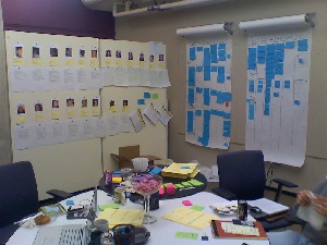
We began by having each field team present an overview of their participants. Our data entry items had been printed on Post-It notes; as we discussed what we thought was significant about each participant, we stuck the associated Post-It on a large sheet of paper representing that person.
As we talked about the participants, we began to see patterns emerge. At the beginning of the analysis phase, we had no idea how many personas we would end up with, but it soon became apparent that our 20 participants fell very clearly into three distinct groups. We created affinity diagrams to determine which characteristics of each participant were statistically significant. Next, we analyzed the three groups to determine the differentiating factors that caused an individual to belong to one group but not the others.
I’ve just described the process in two short paragraphs (and unfortunately I can’t go into detail about our findings for reasons of confidentiality), but in fact it was a full week of intense, exhausting, rewarding discussion. There were numerous inspired brainstorms and “a-ha!” moments. By the end of the week, I wanted to start my own online bank to deliver some of the amazing ideas we had come up with!
So, would I want to do this for a living? Yes and no. I find UX research extremely interesting, and interaction design is a wonderful creative outlet. I’m passionate about usability, but therein lies the problem: usability is not a verb. Toward the end of my week at Lextant, it began to dawn on me that ultimately we must create an application that Fiserv can sell to banks, which are primarily interested in “optimizing the online channel”: finding ways to separate customers from their money. Usability is a tool to attract eyeballs, but it’s far from the top priority.
I’d consider a career in UX if it were in an environment in which usability is a first-class citizen, where the people making the decisions are as passionate about UX as I am. Otherwise I would just be tilting at windmills.
Business Week: Usability Is Next to Profitability. A nice piece on the business case for usability. According to the article, companies are beginning to learn that a focus on usability doesn't just lengthen schedules and cost more; it actually gives them a competitive advantage.
Interesting piece at Jakob Nielsen's useit.com. Although primarily about Flash-based Web applications, the article makes several good points about the usability of Web apps in general, to wit:
- Web apps are often used infrequently (perhaps just once) and without extensive training. They must, therefore, be simple, without excessive features;
- Web apps should provide an overview of features and basic task flow, so that users can quickly understand what the app does and how it benefits them;
- Web users tend to ignore anything that looks like an ad. If you over-promote features of your site (with graphics, animation, etc.), users are likely to miss it.
Speaking of user experience (see below), what do you think of this article on Microsoft's "inductive" user interface guidelines? Essentially, it argues that a good UI helps the user answer two fundamental questions when looking at a screen: "What am I supposed to do now?" and, "Where do I go from here to accomplish my next task?" The UI helps answer these questions by focusing each screen on a single task, and by providing clear links in consistent locations to secondary tasks.
I've tried to apply these guidelines in the design of my current project (a browser-based content management system), but I wonder if the principles apply primarily to infrequently-used apps? Will frequent/experienced users become annoyed at the "one screen per task" hand-holding approach of the inductive user interface? Joel Spolsky makes an interesting point about the difference between learnability and usability. I'm having a difficult time finding the right balance between the two.
Amazon.com rocks! OK, I'll admit that it's a little weird that a single site sells books, CDs, electronics, power tools and clothing. But, its product catalog notwithstanding, if I were creating an e-commerce site, I would imitate as much about Amazon.com as I thought I could get away with. I love its personalization features, and it simply makes online shopping a breeze. GoodExperience.com features an interview with Maryam Mohit, Amazon.com's V.P. of Site Development, with responsibility for the online customer experience. Want your e-commerce site to rock? Check it out.
